Project Summary
Create a UI refresh to the PLP eCommerce pages to allow these pages to be more mobile and tablet-friendly.
My Role
UI Design
Responsibilities
Wireframes
High Fidelity UI Design
Front-End Dev Delivery & Communication
2020
Completion Date
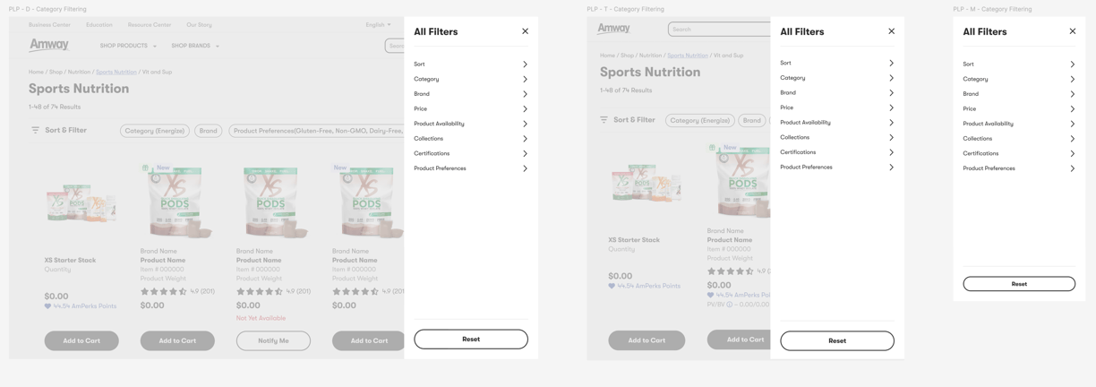
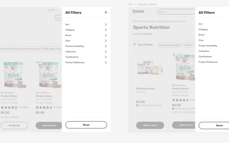
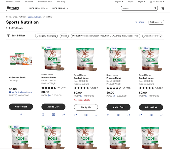
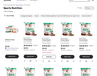
Product List Page Tiles & Filtering
Results
For research, I mostly identified Target's site as a reference point for the filtering aspect of this project. We have similar categories of products and thought that they did a great job at it.
The Challenge
This project was to create a better viewing experience with more products shown per view than the current version. The previous PLP pages only showed three columns across most desktop/laptop monitors. The second objective of this redesign was the filtering and sorting UI. Previously our action/buttons for filtering and sorting were not very mobile device-friendly and made it difficult for mobile users to filter their searches down.
Research & Insights
Design Approach
Step 1 - UI Design: Sketches and wireframes were generated to find the best way to get as many products within view as possible.
Step 2 - Collaboration & Delivery: Working with the devs along the way to make sure what was being designed would be able to be developed and work as designed.
The redesign was able to produce a layout for five columns. This greatly expanded a user view of more products at one time and created less scrolling and less hidden below-the-fold products that may have not been seen previously.
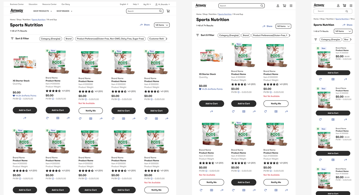
Cards Layout - Final UI